Smart Scheduler
PROJECT OVERVIEW
Smart Scheduler was designed to solve a problem every busy student and young professional knows too well — the mental load of managing a fragmented digital life across Outlook, Google Calendar, Apple Calendar, Canvas, GroupMe, WhatsApp, iMessage, Instagram, and beyond. Rather than forcing users to context-switch between apps, Smart Scheduler consolidates everything into a single, intelligent hub.
At its core, the app uses AI integration to learn from user behavior, asking productivity questions over time to understand when you work best, what you tend to neglect, and where your schedule has room to grow. It then proactively suggests tasks and time blocks tailored to your habits and schedule — so instead of just organizing your life, it actively helps you optimize it.
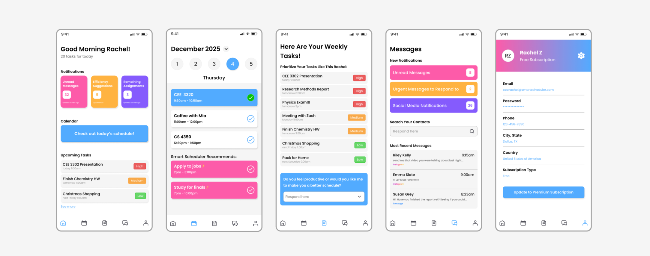
01 — HOME
The home screen is designed to give users an immediate snapshot of their day the moment they open the app. A personalized greeting sets a warm tone while displaying the total number of tasks ahead, so users always know what they're walking into. Three color-coded notification cards — unread messages, AI-generated efficiency suggestions, and remaining assignments — display the most important updates at a glance, each with a live count and timestamp so nothing slips through the cracks. A prominent calendar button invites users to jump directly into their daily schedule, while an Upcoming Tasks preview below displays upcoming items ranked by priority with a "See more" link to the full list.
The app's color palette was a deliberate design choice — clean whites and soft neutrals form the base, contrasted with bold accents of pink, yellow, purple, and blue throughout buttons, cards, and task labels. This was intentional — designed to appeal to a younger audience and make managing a busy schedule feel less like a chore and more like something worth engaging with.
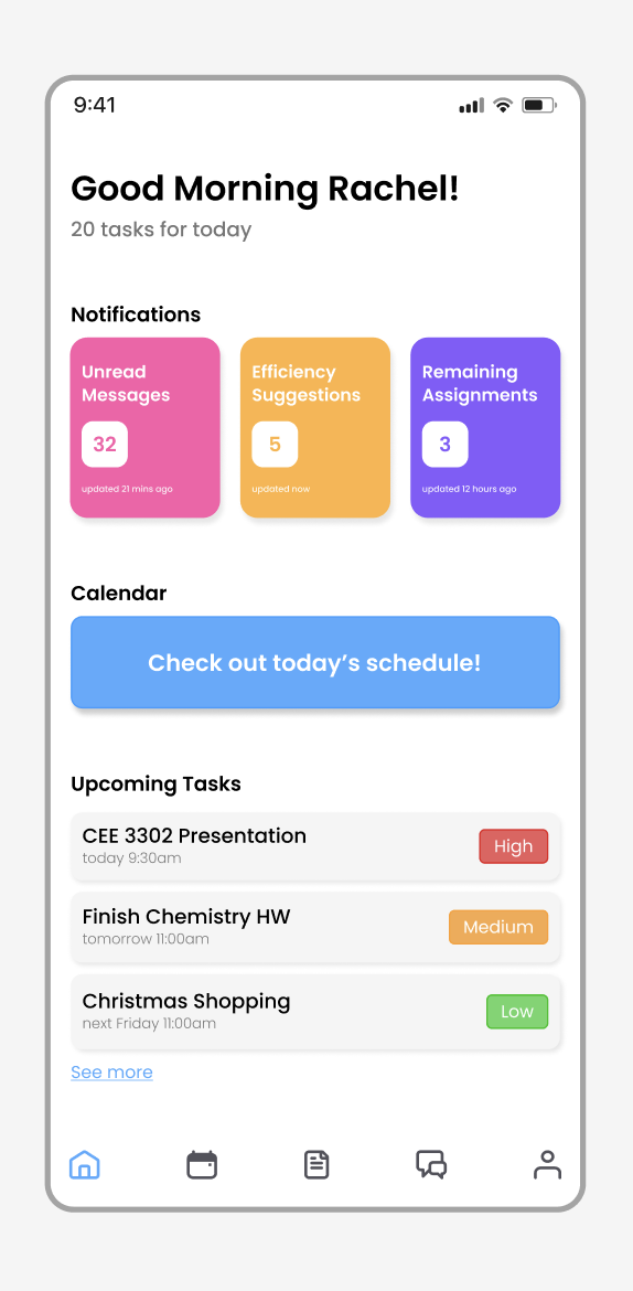
02 — CALENDAR
The calendar screen goes beyond a standard day planner. Alongside your synced events and appointments, Smart Scheduler surfaces its own AI-generated recommendations — highlighted in pink to visually distinguish them from user-entered items. These suggestions are informed by your task list, deadlines, and learned behavior patterns, filling the gaps in your schedule with meaningful, prioritized activity.
As tasks are completed, users can check them off directly from the calendar view, turning the item blue to signal completion at a glance. For a cleaner, distraction-free experience, users also have the option to have completed tasks automatically disappear from their calendar dashboard, keeping the focus on what still needs to get done.
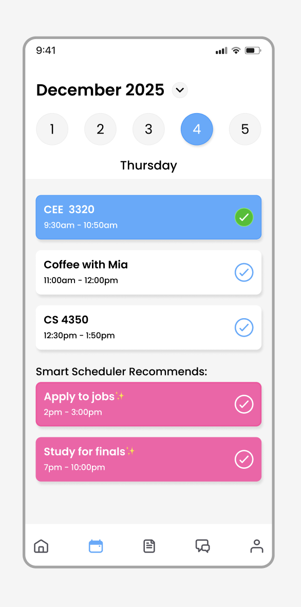
03 — TASKS
The tasks screen presents your weekly workload ranked by urgency — high, medium, and low — giving you an immediate, honest picture of what needs your attention first. At the bottom, a conversational AI prompt invites you to reflect on your productivity and optionally request a smarter, restructured schedule. Over time, these interactions help the app learn your rhythms and refine its recommendations.
04 — MESSAGES
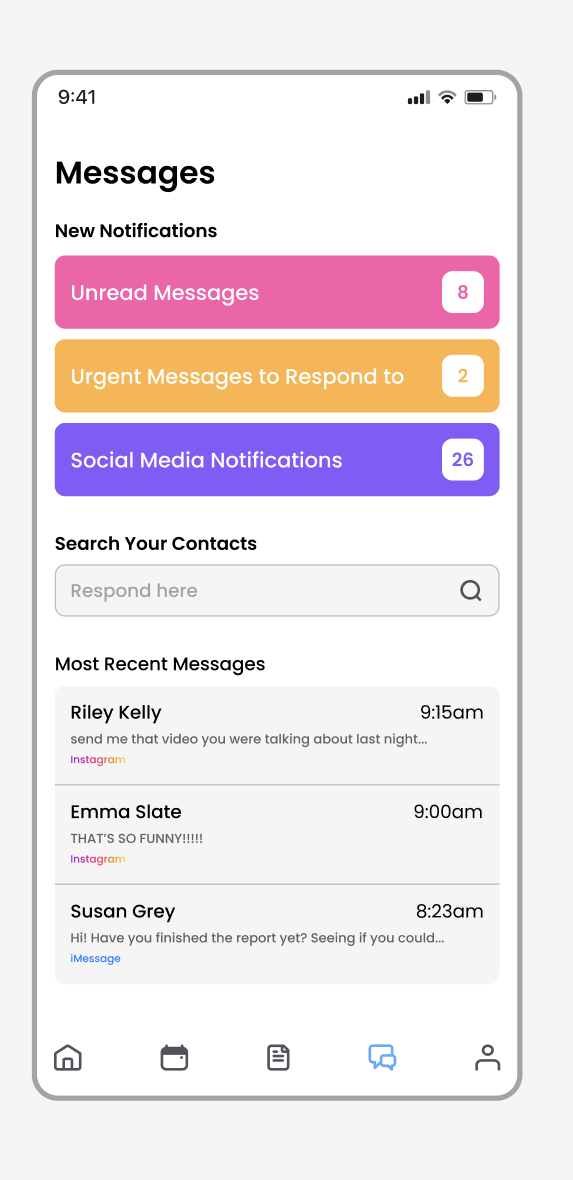
The messages screen consolidates notifications and conversations from all connected platforms into one unified inbox. New notifications are sorted into three bold, color-coded categories — unread messages, urgent responses, and social media — each with a live count. A contact search bar and recent messages feed display conversations alongside their platform source, so users always know where a conversation is happening without ever leaving the app.
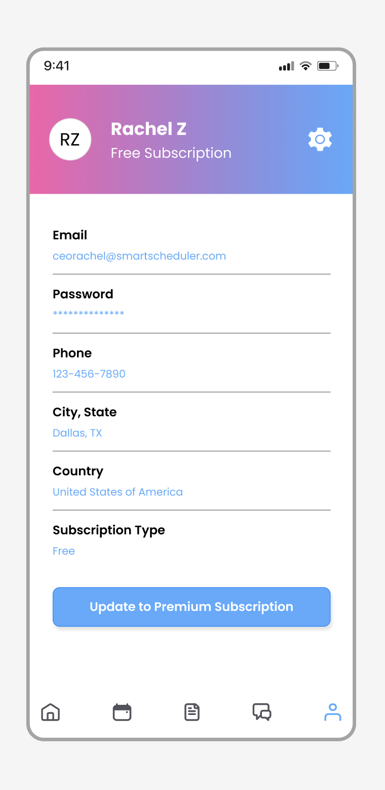
05 — USER PROFILE
Complete App Wireframe